<easing-function>
The <easing-function> CSS data type denotes a mathematical function that describes the rate at which a numerical value changes.
This transition between two values may be applied in different situations. It may be used to describe how fast values change during animations. This lets you vary the animation's speed over the course of its duration. It may also be used to interpolate between two colors in a color gradient. You can specify an easing function for CSS transition and animation properties.
Syntax
/* linear function and keyword */
/* linear(<list-of-points>) */
linear(1, -0.5, 0);
linear;

/* cubic-bezier function and keywords */
/* cubic-bezier(<x1>, <y1>, <x2>, <y2>) */
cubic-bezier(0.42, 0.0, 1.0, 1.0);
ease;
ease-in;
ease-out;
ease-in-out;

/* steps function and keywords */
/* steps(<number-of-steps>, <direction>) */
steps(4, end);
step-start;
step-end;
Values
- list-of-points
-
List of linear stops
- x1, y1, x2, y2
-
<number>values representing the abscissas and ordinates of the P1 and P2 points defining the cubic Bézier curve. x1 and x2 must be in the range[0, 1], otherwise the value is invalid. ease-
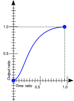
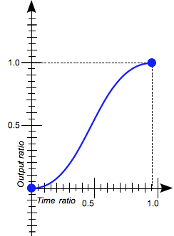
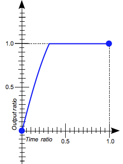
Indicates that the interpolation starts slowly, accelerates sharply, and then slows gradually towards the end. This keyword represents the easing function
cubic-bezier(0.25, 0.1, 0.25, 1.0). It is similar toease-in-out, though it accelerates more sharply at the beginning.
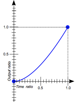
ease-in-
Indicates that the interpolation starts slowly, then progressively speeds up until the end, at which point it stops abruptly. This keyword represents the easing function
cubic-bezier(0.42, 0.0, 1.0, 1.0).
ease-in-out-
Indicates that the interpolation starts slowly, speeds up, and then slows down towards the end. This keyword represents the easing function
cubic-bezier(0.42, 0.0, 0.58, 1.0). At the beginning, it behaves like theease-infunction; at the end, it is like theease-outfunction.
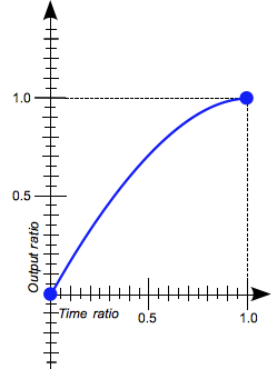
ease-out-
Indicates that the interpolation starts abruptly and then progressively slows down towards the end. This keyword represents the easing function
cubic-bezier(0.0, 0.0, 0.58, 1.0).
- number-of-steps
-
A strictly positive
<integer>, representing the amount of equidistant treads composing the stepping function. - direction
-
One of the following keywords that indicate when the jumps occur:
jump-startdenotes that the first step or jump happens when the interpolation begins.jump-enddenotes that the last step or jump happens when the interpolation ends.jump-bothdenotes that jumps occur at both the 0% and 100% marks, effectively adding a step during the interpolation iteration.jump-nonedenotes no jump on either end. Instead, holding at both the 0% mark and the 100% mark, each for 1/n of the duration.startis the equivalent ofjump-start.endis the equivalent ofjump-end. This is the default.
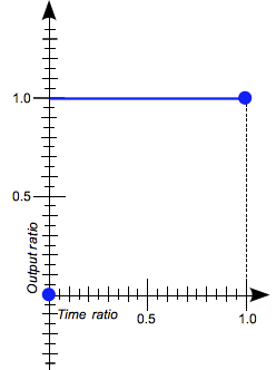
step-start-
Indicates that the interpolation jumps immediately to its final state, where it stays until the end. This keyword represents the easing function
steps(1, jump-start)orsteps(1, start).
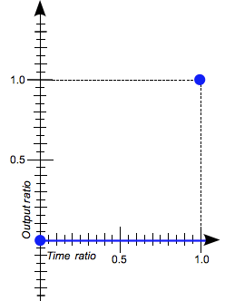
step-end-
Indicates that the interpolation stays in its initial state until the end, at which point it jumps directly to its final state. This keyword represents the easing function
steps(1, jump-end)orsteps(1, end).
Description
There are three types of easing functions:
Linear easing function
The linear() function defines a piecewise linear function that interpolates linearly between its points, allowing you to approximate more complex animations like bounce and elastic effects. The interpolation is done at a constant rate from beginning to end. A typical use of the linear() function is to provide many points to create the illusion of a curve.
When you define the linear() function, you specify the linear easing points as a list, as in, linear(0, 0.25, 1). This linear() function produces an easing function that moves linearly from 0, to 0.25, then to 1.
Consider another example of the function: linear(0, 0.25 75%, 1). This produces a linear easing function that spends 75% of the time transitioning from 0 to .25 and the last 25% transitioning from .25 to 1.
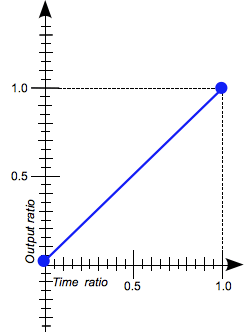
The linear keyword produces a linear() function with two points. This is equivalent to the easing function cubic-bezier(0.0, 0.0, 1.0, 1.0).
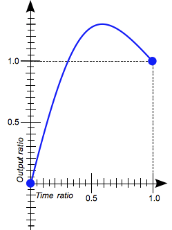
Cubic Bézier easing function
The cubic-bezier() functional notation defines a cubic Bézier curve. The easing functions in the cubic-bezier subset of easing functions are often called "smooth" easing functions because they can be used to smooth down the start and end of the interpolation. They correlate an input ratio to an output ratio, both expressed as <number>s. For these values, 0.0 represents the initial state, and 1.0 represents the final state.
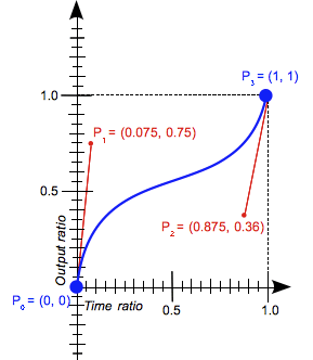
A cubic Bézier curve is defined by four points: P0, P1, P2, and P3.
- The points P0 and P3 represent the start and the end of the curve. In CSS, these points are fixed as the coordinates are ratios (the abscissa the ratio of time, the ordinate the ratio of the output range).
- P0 is
(0, 0)and represents the initial time or position and the initial state. - P3 is
(1, 1)and represents the final time or position and the final state.
Not all cubic Bézier curves are suitable as easing functions because not all are mathematical functions; i.e., curves that for a given abscissa have zero or one value. With P0 and P3 fixed as defined by CSS, a cubic Bézier curve is a function, and is therefore valid, if and only if the abscissas of P1 and P2 are both in the [0, 1] range.
Cubic Bézier curves with the P1 or P2 ordinate outside the [0, 1] range can cause the value to go farther than the final state and then return. In animations, for some properties, such as left or right, this creates a kind of "bouncing" effect.
However, certain properties will restrict the output if it goes outside an allowable range. For example, a color component greater than 255 or smaller than 0 will be clipped to the closest allowed value (255 and 0, respectively). Some cubic-bezier() curves exhibit this property.
When you specify an invalid cubic-bezier curve, CSS ignores the whole property.
The cubic-bezier() function can also be specified using these keywords, each of which represent a specific cubic-bezier() notation: ease, ease-in, ease-out, and ease-in-out.
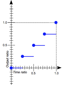
Step easing function
The steps() functional notation defines a step function that divides the domain of output values in equidistant steps. This subclass of step functions are sometimes also called staircase functions.
These are a few examples illustrating the steps() function:
steps(2, jump-start)
steps(2, start)
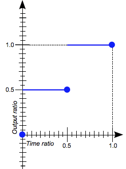
steps(4, jump-end)
steps(4, end)
steps(5, jump-none)
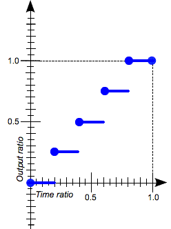
steps(3, jump-both)
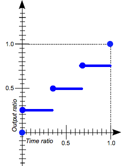
The steps() function can also be specified using these keywords, each of which represent a specific steps() notation: step-start and step-end.
Formal syntax
<easing-function> =
  linear                          |
  <linear-easing-function>        |
  <cubic-bezier-easing-function>  |
  <step-easing-function>

<linear-easing-function> =
  linear( <linear-stop-list> )

<cubic-bezier-easing-function> =
  ease                                                |
  ease-in                                             |
  ease-out                                            |
  ease-in-out                                         |
  cubic-bezier( <number [0,1]> , <number> , <number [0,1]> , <number> )

<step-easing-function> =
  step-start                                |
  step-end                                  |
  steps( <integer> [, <step-position> ]? )

<linear-stop-list> =
  [ <linear-stop> ]#

<step-position> =
  jump-start  |
  jump-end    |
  jump-none   |
  jump-both   |
  start       |
  end

<linear-stop> =
  <number>               &&
  <linear-stop-length>?

<linear-stop-length> =
  <percentage>{1,2}
Examples
Comparing the easing functions
This example provides an easy comparison between the different easing functions using an animation. From the drop-down menu, you can select an easing function – there are a couple of keywords and some cubic-bezier() and steps() options. After selecting an option, you can start and stop the animation using the provided button.
HTML
<div>
  <div></div>
</div>
<ul>
  <li>
    <button class="animation-button">Start animation</button>
  </li>
  <li>
    <label for="easing-select">Choose an easing function:</label>
    <select id="easing-select">
      <option selected>linear</option>
      <option>linear(0, 0.5 50%, 1)</option>
      <option>ease</option>
      <option>ease-in</option>
      <option>ease-in-out</option>
      <option>ease-out</option>
      <option>cubic-bezier(0.1, -0.6, 0.2, 0)</option>
      <option>cubic-bezier(0, 1.1, 0.8, 4)</option>
      <option>steps(5, end)</option>
      <option>steps(3, start)</option>
      <option>steps(4)</option>
    </select>
  </li>
</ul>
CSS
body > div {
  position: relative;
  height: 100px;
}

div > div {
  position: absolute;
  width: 50px;
  height: 50px;
  background-color: blue;
  background-image: radial-gradient(
    circle at 10px 10px,
    rgba(25, 255, 255, 0.8),
    rgba(25, 255, 255, 0.4)
  );
  border-radius: 50%;
  top: 25px;
  animation: 1.5s infinite alternate;
}

@keyframes move-right {
  from {
    left: 10%;
  }

  to {
    left: 90%;
  }
}

li {
  display: flex;
  align-items: center;
  justify-content: center;
  margin-bottom: 20px;
}
JavaScript
const selectElem = document.querySelector("select");
const startBtn = document.querySelector("button");
const divElem = document.querySelector("div > div");

startBtn.addEventListener("click", () => {
  if (startBtn.textContent === "Start animation") {
    divElem.style.animationName = "move-right";
    startBtn.textContent = "Stop animation";
    divElem.style.animationTimingFunction = selectElem.value;
  } else {
    divElem.style.animationName = "unset";
    startBtn.textContent = "Start animation";
  }
});

selectElem.addEventListener("change", () => {
  divElem.style.animationTimingFunction = selectElem.value;
});
Result
Using the cubic-bezier() function
These cubic Bézier curves are valid for use in CSS:
/* The canonical Bézier curve with four <number> in the [0,1] range. */
cubic-bezier(0.1, 0.7, 1.0, 0.1)

/* Using <integer> is valid because any <integer> is also a <number>. */
cubic-bezier(0, 0, 1, 1)

/* Negative values for ordinates are valid, leading to bouncing effects.*/
cubic-bezier(0.1, -0.6, 0.2, 0)

/* Values greater than 1.0 for ordinates are also valid. */
cubic-bezier(0, 1.1, 0.8, 4)
These cubic Bézier curves definitions are invalid:
/* Though the animated output type may be a color,
   Bézier curves work with numerical ratios.*/
cubic-bezier(0.1, red, 1.0, green)

/* Abscissas must be in the [0, 1] range or
   the curve is not a function of time. */
cubic-bezier(2.45, 0.6, 4, 0.1)

/* The two points must be defined, there is no default value. */
cubic-bezier(0.3, 2.1)

/* Abscissas must be in the [0, 1] range or
   the curve is not a function of time. */
cubic-bezier(-1.9, 0.3, -0.2, 2.1)
Using the steps() function
These easing functions are valid:
/* There are 5 treads, the last one happens
   right before the end of the animation. */
steps(5, end)

/* A two-step staircase, the first one happening
   at the start of the animation. */
steps(2, start)

/* The second parameter is optional. */
steps(2)
Note: If the animation contains multiple stops, then the steps specified in the steps() function will apply to each section. Therefore, an animation with three segments and steps(2) will contain 6 steps in total, 2 per segment.
These easing functions are invalid:
/* The first parameter must be an <integer> and
   cannot be a real value, even if it is equal to one. */
steps(2.0, jump-end)

/* The amount of steps must be non-negative. */
steps(-3, start)

/* There must be at least one step.*/
steps(0, jump-none)
Specifications
| Specification |
|---|
| CSS Easing Functions Level 1 # easing-functions |
Browser compatibility
BCD tables only load in the browser