<basic-shape>
The <basic-shape> CSS data type represents a shape used in the clip-path, shape-outside, and offset-path properties.
Try it
Syntax
The <basic-shape> data type is defined with one of the basic shape functions listed below.
When creating a shape, the reference box is defined by each property that uses <basic-shape> values. The coordinate system for the shape has its origin at the top-left corner of the reference box, with the x-axis running to the right and the y-axis running downwards. All the lengths expressed in percentages are resolved from the used dimensions of the reference box.
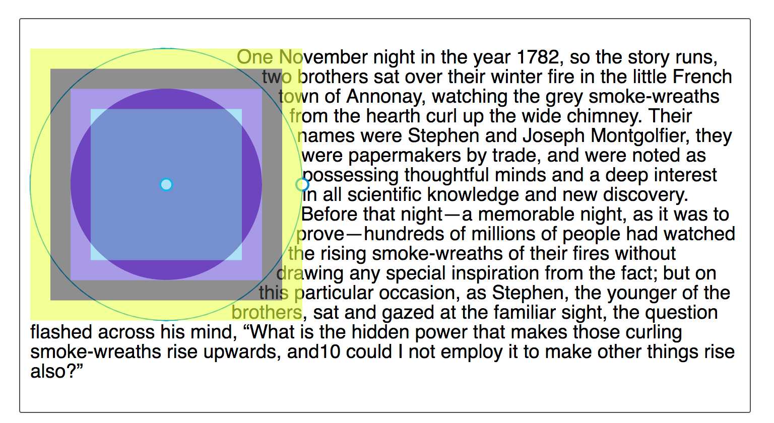
The default reference box is the margin-box, as demonstrated in the below image which shows a circle created using shape-outside: circle(50%). The shape is being defined with reference to the margin box.
Shape functions
The following shapes are supported. All <basic-shape> values use functional notation and are defined here using the value definition syntax.
inset()-
Defines an inset rectangle.
inset( <shape-arg>{1,4} [round <border-radius>]? )When all of the first four arguments are supplied they represent the top, right, bottom and left offsets from the reference box inward that define the positions of the edges of the inset rectangle. These arguments follow the syntax of the margin shorthand, that let you set all four insets with one, two or four values.
The optional
<border-radius>argument(s) define rounded corners for the inset rectangle using the border-radius shorthand syntax.A pair of insets in either dimension that add up to more than the used dimension (such as left and right insets of 75% apiece) define a shape enclosing no area. For this specification, this results in an empty float area.
circle()-
Defines a circle using a radius and a position.
circle( [<shape-radius>]? [at <position>]? )The
<shape-radius>argument represents r, the radius of the circle. Negative values are invalid. A percentage value here is resolved from the used width and height of the reference box assqrt(width^2+height^2)/sqrt(2).The
<position>argument defines the center of the circle. This defaults to center if omitted. ellipse()-
Defines an ellipse using two radii and a position.
ellipse( [<shape-radius>{2}]? [at <position>]? )The
<shape-radius>arguments represent rx and ry, the x-axis and y-axis radii of the ellipse, in that order. Negative values for either radius are invalid. Percentage values here are resolved against the used width (for the rx value) and the used height (for the ry value) of the reference box.The position argument defines the center of the ellipse. This defaults to center if omitted.
polygon()-
Defines a polygon using an SVG
fill-ruleand a set of vertices.polygon( [<fill-rule>,]? [<shape-arg> <shape-arg>]# )<fill-rule>represents thefill-ruleused to determine the interior of the polygon. Possible values arenonzeroandevenodd. Default value when omitted isnonzero.Each pair argument in the list represents xi and yi - the x and y axis coordinates of the vertex of the polygon at position i.
path()-
Defines a shape using an SVG
fill-ruleand an SVG path definition.path( [<fill-rule>,]? <string>)The optional
<fill-rule>represents thefill-ruleused to determine the interior of the path. Possible values arenonzeroandevenodd. Default value when omitted isnonzero.The required <string> is an SVG Path string encompassed in quotes
The arguments not defined above are defined as follows:
<shape-arg> = <length> | <percentage>
<shape-radius> = <length> | <percentage> | closest-side | farthest-side
Defines a radius for a circle or ellipse. If omitted it defaults to closest-side.
closest-side uses the length from the center of the shape to the closest side of the reference box. For circles, this is the closest side in any dimension. For ellipses, this is the closest side in the radius dimension.
farthest-side uses the length from the center of the shape to the farthest side of the reference box. For circles, this is the farthest side in any dimension. For ellipses, this is the farthest side in the radius dimension.
Description
Computed values of basic shapes
The values in a <basic-shape> function are computed as specified, with these exceptions:
- Omitted values are included and compute to their defaults.
- A
<position>value incircle()orellipse()is computed as a pair of offsets (horizontal then vertical) from the top left origin, each given as a combination of an absolute length and a percentage. - A
<border-radius>value ininset()is computed as an expanded list of all eight<length>or percentage values.
Interpolation of basic shapes
When animating between one <basic-shape> and another, the rules below are applied. The values in the shape functions interpolate as a simple list. The list values interpolate as <length>, <percentage>, or calc() where possible. If list values are not one of those types but are identical, those values do interpolate.
- Both shapes must use the same reference box.
- If both shapes are the same type, that type is
ellipse()orcircle(), and none of the radii use theclosest-sideorfarthest-sidekeywords, interpolate between each value in the shape functions. - If both shapes are of type
inset(), interpolate between each value in the shape functions. - If both shapes are of type
polygon(), both polygons have the same number of vertices, and use the same<fill-rule>, interpolate between each value in the shape functions. - If both shapes are of type
path(), both paths strings have the same number and types of path data commands in the same order, interpolate each path data command as real numbers. - In all other cases no interpolation occurs.
Examples
Animated polygon
In this example, we use the @keyframes at-rule to animate a clip path between two polygons. Note that both polygons have the same number of vertices, which is necessary for this type of animation to work.
HTML
<div></div>
CSS
div {
  width: 300px;
  height: 300px;
  background: repeating-linear-gradient(red, orange 50px);
  clip-path: polygon(
    50% 0%,
    60% 40%,
    100% 50%,
    60% 60%,
    50% 100%,
    40% 60%,
    0% 50%,
    40% 40%
  );
  animation: 4s poly infinite alternate ease-in-out;
  margin: 10px auto;
}

@keyframes poly {
  from {
    clip-path: polygon(
      50% 0%,
      60% 40%,
      100% 50%,
      60% 60%,
      50% 100%,
      40% 60%,
      0% 50%,
      40% 40%
    );
  }

  to {
    clip-path: polygon(
      50% 30%,
      100% 0%,
      70% 50%,
      100% 100%,
      50% 70%,
      0% 100%,
      30% 50%,
      0% 0%
    );
  }
}
Result
Specifications
| Specification |
|---|
| CSS Shapes Module Level 1 # basic-shape-functions |
Browser compatibility
BCD tables only load in the browser
See also
- Properties that use this data type:
clip-path,shape-outside - Edit Shape Paths in CSS — Firefox Developer Tools
- Overview of CSS Shapes