Typesetting a community school homepage
In this assessment, we'll test your understanding of all the text styling techniques we've covered throughout this module by getting you to style the text for a community school's homepage. You might just have some fun along the way.
| Prerequisites: | Before attempting this assessment you should have already worked through all the articles in this module. |
|---|---|
| Objective: | To test comprehension of CSS text styling techniques. |
Starting point
To get this assessment started, you should:
- Go and grab the HTML and CSS files for the exercise, and the provided external link icon.
- Make a copy of them on your local computer.
Alternatively, you could use a site like JSBin or Glitch to do your assessment. You could paste the HTML and fill in the CSS into one of these online editors, and use this URL to point to the background image. If the online editor you are using doesn't have a separate CSS panel, feel free to put it in a <style> element in the head of the document.
Note: If you get stuck, then ask us for help — see the Assessment or further help section at the bottom of this page.
Project brief
You've been provided with some raw HTML for the homepage of an imaginary community college, plus some CSS that styles the page into a three column layout and provides some other rudimentary styling. You're to write your CSS additions below the comment at the bottom of the CSS file to make sure it's easy to mark the bits you've done. Don't worry if some of the selectors are repetitious; we'll let you off in this instance.
Fonts:
- First of all, download a couple of free-to-use fonts. Because this is a college, the fonts should be chosen to give the page a fairly serious, formal, trustworthy feel: a serif site-wide font for the general body text, coupled with a sans-serif or slab serif for the headings might be nice.
- Use a suitable service to generate bulletproof
@font-facecode for these two fonts. - Apply your body font to the whole page, and your heading font to your headings.
General text styling:
- Give the page a site-wide
font-sizeof10px. - Give your headings and other element types appropriate font-sizes defined using a suitable relative unit.
- Give your body text a suitable
line-height. - Center your top level heading on the page.
- Give your headings a little bit of
letter-spacingto make them not too squashed, and allow the letters to breathe a bit. - Give your body text some
letter-spacingandword-spacing, as appropriate. - Give the first paragraph after each heading in the
<section>a little bit of text-indentation, say 20px.
Links:
- Give the link, visited, focus, and hover states some colors that go with the color of the horizontal bars at the top and bottom of the page.
- Make it so that links are underlined by default, but when you hover or focus them the underline disappears.
- Remove the default focus outline from ALL the links on the page.
- Give the active state a noticeably different styling so it stands out nicely, but make it still fit in with the overall page design.
- Make it so that external links have the external link icon inserted next to them.
Lists:
- Make sure the spacing of your lists and list items works well with the styling of the overall page. Each list item should have the same
line-heightas a paragraph line, and each list should have the same spacing at its top and bottom as you have between paragraphs. - Give your list items a nice bullet appropriate for the design of the page. It is up to you whether you choose a custom bullet image or something else.
Navigation menu:
- Style your navigation menu so that it harmonizes with the page.
Hints and tips
- You don't need to edit the HTML in any way for this exercise.
- You don't necessarily have to make the nav menu look like buttons, but it needs to be a bit taller so that it doesn't look silly on the side of the page; also remember that you need to make this one a vertical nav menu.
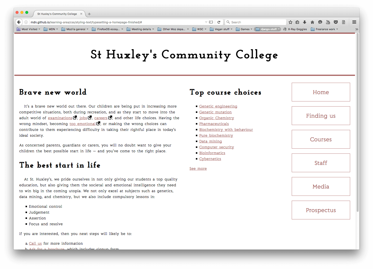
Example
The following screenshot shows an example of what the finished design could look like:
Assessment or further help
If you would like your work assessed or are stuck and want to ask for help:
- Put your work into an online shareable editor such as CodePen, jsFiddle, or Glitch.
- Write a post asking for assessment and/or help at the MDN Discourse forum Learning category. Your post should include:
- A descriptive title such as "Assessment wanted for Typesetting a community school homepage".
- Details of what you have already tried and what you would like us to do; for example, tell us if you're stuck and need help or want an assessment.
- A link to the example you want assessed or need help with, in an online shareable editor (as mentioned in step 1 above). This is a good practice to get into — it's very hard to help someone with a coding problem if you can't see their code.
- A link to the actual task or assessment page, so we can find the question you want help with.