Card
This pattern is a list of "card" components with optional footers.
Requirements
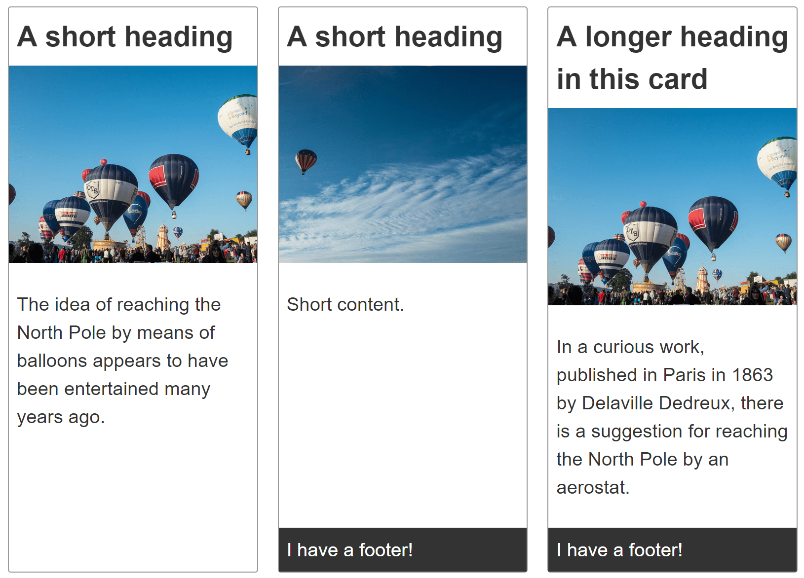
The card component can contain a variety of content, including a heading, image, content and a footer.
Each card should be the same height, and footers should stick to the bottom of the card.
When added to a collection of cards, the cards should line up in two dimensions.
Recipe
Choices made
The card is laid out using CSS Grid Layout despite being a single dimensional layout, as it enables the use of content sizing for the grid tracks. When setting up the single column grid I use the following:
.card {
  display: grid;
  grid-template-rows: max-content 200px 1fr;
}
The heading track is set to max-content, which prevents it from stretching. I have decided that I want my image to live within a track that is 200 pixels tall. I then set the next track — which is where the content lives — to 1fr. This means it will take up any additional space.
If the track does have a footer it will be auto-sized, as rows created in the implicit grid are auto-sized by default. Therefore this will fit the content added to it.
Note: The various elements in separate cards do not align with each other, as each card is an independent grid. The proposed subgrid feature of Grid Level 2 would give a solution to this issue.
Useful fallbacks or alternative methods
Flexbox could be used to lay out the card, in which case you should make the content area grow, and other items not grow. This would be a reasonable way to lay out the card, although I have a slight preference for being able to control the tracks from the container rather than needing to add rules to the items.
For the overall layout you could use flexbox, however this will result in cards stretching over the final flex row where there are fewer than can fit in the rows above. Alternatively you could use CSS multi-col — this would cause the cards to lay out down the columns, which may or may not be a problem.
See the columns recipe for demonstrations of each of these layout methods.
Accessibility concerns
Depending on the content of your card there may be things you could, or should do to enhance accessibility. See Inclusive Components: Card by Heydon Pickering, for a very detailed explanation of these issues.
Browser compatibility
css.properties.grid-template-columns
BCD tables only load in the browser
css.properties.grid-template-rows
BCD tables only load in the browser