一般的な HTML と CSS の問題への対処
ここでは、HTML と CSS のコードで発生する可能性のある一般的なクロスブラウザーの問題、および問題の発生を防ぐため、または発生する問題を修正するために使用できるツールについて具体的に説明します。これには、コードのリンティング、CSS プレフィックスの処理、問題を追跡するためのブラウザーの開発者ツールの使用、ブラウザーにサポートを追加するための polyfill の使用、レスポンシブデザイン問題への取り組みなどが含まれます。
| 前提条件: | 主要な HTML、CSS、および JavaScript 言語に精通していること。クロスブラウザーテストの原則の高水準のアイデア。 |
|---|---|
| 目標: | 一般的な HTML と CSS のクロスブラウザーの問題を診断し、それらを修正するための適切なツールとテクニックを使うことができるようにする。 |
HTML と CSS の問題
一部の HTML と CSS の問題は、両方の言語がかなり単純で、コードがうまく作成され、効率的であり、ページ上に「機能の目的」を意味的に記述していることを確認するという意味で開発者がそれらについて真剣に考えていないという事実にあります。最悪の場合、JavaScript を使用して Web ページのコンテンツとスタイル全体を生成するため、ページにアクセスできなくなり、パフォーマンスが低下します (DOM 要素の生成にはコストがかかります)。他のケースでは、初期の機能がブラウザー間で一貫してサポートされていないため、一部の機能やスタイルが一部のユーザには機能しないことがあります。 レスポンシブデザインの問題も一般的です。デスクトップブラウザーで見栄えの良いサイトはモバイル端末だとひどい経験を提供するかもしれません、内容が読むには小さすぎるか、高精細なアニメーションのせいで遅いでしょう。
HTML/CSS に起因するクロスブラウザーエラーを減らす方法を見てみましょう。
まず最初に:一般的な問題を解決する
このシリーズの最初の記事では、まずクロスブラウザーの問題に集中する前に、デスクトップ/モバイルの最新ブラウザーでいくつかテストしてコードが正常に機能するか確認することをお勧めします。
HTML のデバッグおよび CSS のデバッグの記事では、HTML/CSS のデバッグに関する基本的なガイダンスをいくつか提供しました。基本に慣れていない場合は、先に進む前に必ずこれらの記事をよく読んでください。
基本的には、HTML と CSS のコードが整形式で、構文エラーがないかどうかをチェックすることです。
メモ: CSS と HTML に関する一般的な問題の 1 つは、異なる CSS ルールが互いに矛盾が生じるときに発生します。 サードパーティのコードを使用している場合、これは特に問題になる可能性があります。たとえば、CSS フレームワークを使用して、それが使用しているクラス名の 1 つが別の目的ですでに使用されているものと衝突しているとします。 または、ある種のサードパーティ API (たとえば広告バナーの生成) によって生成された HTML に、すでに別の目的で使用されているクラス名または ID が含まれていることもあります。これが起こらないようにするには、最初に使用しているツールを調べて、それらを中心にコードを設計する必要があります。また、"名前空間" CSS も価値があります。ウィジェットがある場合は、それが明確なクラスを持っていることを確認してから、このクラスでウィジェット内の要素を選択するセレクタを起動します。そうすれば競合は起こりにくくなります。例えば、 .audio-player ul a です。
検証
HTML の検証では、すべてのタグが適切に閉じられてネストされていること、DOCTYPE を使用していること、およびタグを正しい目的で使用していることを確認します。良い戦略はコードを定期的に検証することです。これを可能にするサービスの 1 つに、W3C マークアップ検証サービスがあります。これを使用すると、コードを指定してエラーのリストを返すことができます。
CSS にも同様の話があります — プロパティ名が正しくつづられていること、プロパティ値が正しくつづられていて、それらが使われているプロパティに対して有効であること、中括弧を見逃していないということです。この目的のために、W3C には CSS Validator も用意されています。
Linters
取りうるもう一つの良い選択肢は、エラーを指摘するだけでなく、CSS の悪いプラクティスについての警告、および他の点にもフラグを立てることができる、いわゆる Linter アプリケーションです。Linter は一般的に、エラー/警告の報告においてより厳格またはより緩やかになるようにカスタマイズできます。
オンラインリンターアプリケーションは多数ありますが、そのうち最良のものはおそらく Dirty Markup (HTML、CSS、JavaScript)、および CSS Lint (CSS のみ) です。これらはコードをウィンドウに貼り付けることができ、十字でどんなエラーにでもフラグを立てるでしょう、そしてそれは問題が何であるかを知らせるエラーメッセージを得るためにそれから隠されることができます。Dirty Markup では、Clean ボタンを使用してマークアップを修正することもできます。
However, it is not very convenient to have to copy and paste your code over to a web page to check its validity several times. What you really want is a linter that will fit into your standard workflow with the minimum of hassle.
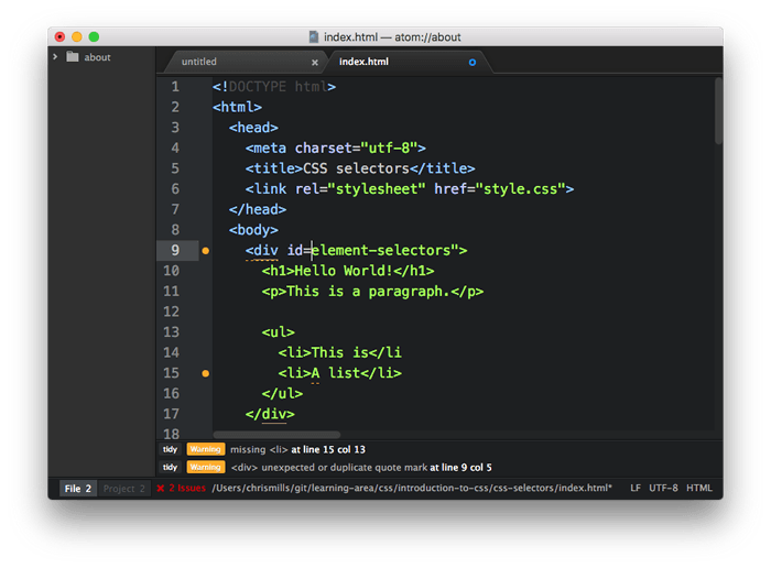
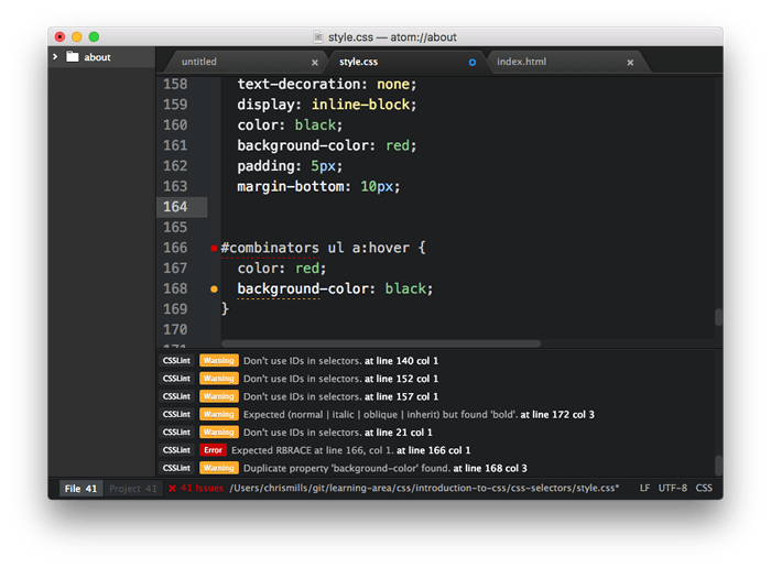
Many code editors have linter plugins. GitHub's Atom code editor for example has a rich plugin ecosystem available, with many linting options. To show you an example of how such plugins generally work:
- Install Atom (if you haven't got an up-to-date version already installed) — download it from the Atom page linked above.
- Go to Atom's Preferences… dialog (e.g. by Choosing Atom > Preferences… on Mac, or File > Preferences… on Windows/Linux) and choose the Install option in the left-hand menu.
- In the Search packages text field, type "lint" and press Enter/Return to search for linting-related packages.
- You should see a package called lint at the top of the list. Install this first (using the Install button), as other linters rely on it to work. After that, install the linter-csslint plugin for linting CSS, and the linter-tidy plugin for linting HTML.
- After the packages have finished installing, try loading up an HTML file and a CSS file: you'll see any issues highlighted with green (for warnings) and red (for errors) circles next to the line numbers, and a separate panel at the bottom provides line numbers, error messages, and sometimes suggested values or other fixes.
Other popular editors have similar linting packages available. For example, see:
- SublimeLinter for Sublime Text
- Notepad++ linter
- VSCode linters
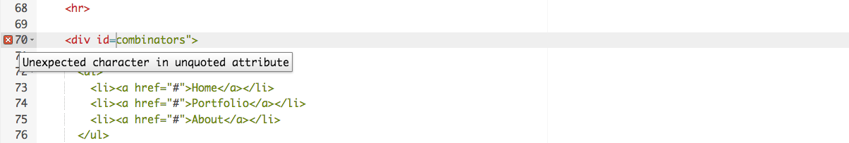
Browser developer tools
The developer tools built into most browsers also feature useful tools for hunting down errors, mainly for CSS.
メモ: ブラウザーが不正な形式のマークアップを自動的に修正しようとするため、HTML エラーは開発ツールではそれほど簡単には表示されない傾向があります。W3C バリデータは HTML エラーを取得するための最良の方法です — 上の Validation を見てください。
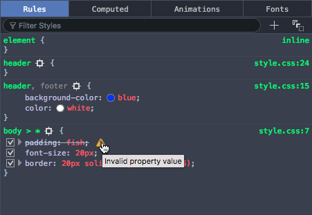
As an example, in Firefox the CSS inspector will show CSS declarations that aren't applied crossed out, with a warning triangle. Hovering the warning triangle will provide a descriptive error message:
Other browser devtools have similar features.
Common cross browser problems
Now let's move on to look at some of the most common cross browser HTML and CSS problems. The main areas we'll look at are lack of support for modern features, and layout issues.
Browsers not supporting modern features
This is a common problem, especially when you need to support old browsers (such as Internet Explorer) or you are using features that are implemented in some browsers but not yet in all. In general, most core HTML and CSS functionality (such as basic HTML elements, CSS basic colors and text styling) works across all the browsers you'll want to support; more problems are uncovered when you start wanting to use newer HTML, CSS, and APIs. MDN displays browser compatibility data for each feature documented; for example, see the browser support table for the :has() pseudo-class.
Once you've identified a list of technologies you will be using that are not universally supported, it is a good idea to research what browsers they are supported in, and what related techniques are useful. See Finding help below.
HTML fallback behavior
Some problems can be solved by just taking advantage of the natural way in which HTML/CSS work.
Unrecognized HTML elements are treated by the browser as anonymous inline elements (effectively inline elements with no semantic value, similar to <span> elements). You can still refer to them by their names, and style them with CSS, for example — you just need to make sure they are behaving as you want them to. Style them just as you would any other element, including setting the display property to something other than inline if needed.
More complex elements like HTML <video>, <audio>, <picture>, <object>,and <canvas> (and other features besides) have natural mechanisms for fallbacks to be added incase the resources linked to are not supported. You can add fallback content in between the opening and closing tags, and non-supporting browsers will effectively ignore the outer element and run the nested content.
For example:
<video id="video" controls preload="metadata" poster="img/poster.jpg">
  <source src="video/tears-of-steel-battle-clip-medium.webm" type="video/webm">
  <!-- Offer download -->
  <p>Your browser does not support WebM video; here is a link to
  <a href="video/tears-of-steel-battle-clip-medium.mp4">view the video directly</a></p>
</video>
This example includes a simple link allowing you to download the video if even the HTML video player doesn't work, so at least the user can still access the video.
Another example is form elements. When new <input> types were introduced for inputting specific information into forms, such as times, dates, colors, numbers, etc., if a browser didn't support the new feature, the browser used the default of type="text". Input types were added, which are very useful, particularly on mobile platforms, where providing a pain-free way of entering data is very important for the user experience. Platforms provide different UI widgets depending on the input type, such as a calendar widget for entering dates. Should a browser not support an input type, the user can still enter the required data.
The following example shows date and time inputs:
<form>
  <div>
    <label for="date">Enter a date:</label>
    <input id="date" type="date">
  </div>
  <div>
    <label for="time">Enter a time:</label>
    <input id="time" type="time">
  </div>
</form>
The output of this code is as follows:
メモ: You can also see this running live as forms-test.html on GitHub (see the source code also).
If you view the example on a supporting browser, you'll see the UI features in action as you try to input data. On devices with dynamic keyboards, type-specific keypads will be displayed. On a non-supporting browser like Internet Explorer, the inputs will just default to normal text inputs, meaning the user can still enter the correct information.
CSS fallback behavior
CSS is arguably better at fallbacks than HTML. If a browser encounters a declaration or rule it doesn't understand, it just skips it completely without applying it or throwing an error. This might be frustrating for you and your users if such a mistake slips through to production code, but at least it means the whole site doesn't come crashing down because of one error, and if used cleverly you can use it to your advantage.
Let's look at an example — a simple box styled with CSS, which has some styling provided by various CSS features:
メモ: You can also see this example running live on GitHub as button-with-fallback.html (also see the source code).
The button has a number of declarations that style, but the two we are most interested in are as follows:
button {
  /* … */

  background-color: #ff0000;
  background-color: rgba(255 0 0 / 1);
  box-shadow: inset 1px 1px 3px rgba(255 255 255 / 0.4),
              inset -1px -1px 3px rgba(0 0 0 / 0.4);
}

button:hover {
  background-color: rgba(255 0 0 / 0.5);
}

button:active {
  box-shadow: inset 1px 1px 3px rgba(0 0 0 / 0.4),
              inset -1px -1px 3px rgba(255 255 255 / 0.4);
}
Here we are providing an RGBA background-color that changes opacity on hover to give the user a hint that the button is interactive, and some semi-transparent inset box-shadow shades to give the button a bit of texture and depth. While now fully supported, RGBA colors and box shadows haven't been around forever; starting in IE9. Browsers that didn't support RGBA colors would ignore the declaration meaning in old browsers the background just wouldn't show up at all so the text would be unreadable, no good at all!
To sort this out, we have added a second background-color declaration, which just specifies a hex color — this is supported way back in really old browsers, and acts as a fallback if the modern shiny features don't work. What happens is a browser visiting this page first applies the first background-color value; when it gets to the second background-color declaration, it will override the initial value with this value if it supports RGBA colors. If not, it will just ignore the entire declaration and move on.
メモ: The same is true for other CSS features like media queries, @font-face and @supports blocks — if they are not supported, the browser just ignores them.
Selector support
Of course, no CSS features will apply at all if you don't use the right selectors to select the element you want to style!
In a comma separated list of selectors, if you just write a selector incorrectly, it may not match any element. If, however, a selector is invalid, the entire list of selectors and the selector block are ignored. For this reason, you never want to include a :-moz- prefixed pseudo class or pseudo-element in a group of selectors as all browsers other than Firefox will ignore the entire block.
We find that it is helpful to inspect the element you are trying to style using your browser's dev tools, then look at the DOM tree breadcrumb trail that DOM inspectors tend to provide to see if your selector makes sense compared to it.
For example, in the Firefox dev tools, you get this kind of output at the bottom of the DOM inspector:
If for example you were trying to use this selector, you'd be able to see that it wouldn't select the input element as desired:
form > #date
(The date form input isn't a direct child of the <form>; you'd be better off using a general descendant selector instead of a child selector).
Handling CSS prefixes
Another set of problems comes with CSS prefixes — these are a mechanism originally used to allow browser vendors to implement their own version of a CSS (or JavaScript) feature while the technology is in an experimental state, so they can play with it and get it right without conflicting with other browser's implementations, or the final unprefixed implementations. So for example:
- Mozilla uses
-moz- - Chrome/Opera/Safari use
-webkit- - Microsoft uses
-ms-
Here's some examples:
-webkit-transform: rotate(90deg);

background-image: -moz-linear-gradient(left ,green, yellow);
background-image: -webkit-gradient(linear, left center, right center, from(green), to(yellow));
background-image: linear-gradient(to right, green, yellow);
While none of these properties requires a prefix, you may encounter this old CSS in a codebase. The first line shows a transform property with a -webkit- prefix — this was needed to make transforms work in older versions of Safari and Chrome until the prefix-free feature was supported.
The last three lines show three different versions of the linear-gradient() function, which is originally how linear gradient were written:
The first one has a -moz- prefix, the second a -webkit- prefix, and the third one has no prefix. This third version shows the final version of the syntax supported in all evergreen browsers.
Prefixed features were never supposed to be used in production websites — they are subject to change or removal without warning, and cause cross browser issues. This is particularly a problem when developers decide to only use say, the -webkit- version of a property — meaning that the site won't work in other browsers. This actually happened so much that other browsers implemented -webkit- prefixed versions of several CSS properties. While browsers still support some prefixed property names, property values, and pseudo classes, now experimental features are put behind flags so developers can test them during development.
If you insist on using prefixed features, make sure you use the right ones. You can look up what browsers require prefixes on MDN reference pages, and sites like caniuse.com. If you are unsure, you can also find out by doing some testing directly in browsers.
Try this simple example:
- Open up google.com, or another site that has a prominent heading or other block-level element.
- Right/Cmd + click on the element in question and choose Inspect/Inspect element (or whatever the option is in your browser) — this should open up the dev tools in your browser, with the element highlighted in the DOM inspector.
- Look for a feature you can use to select that element. For example, at the time of writing, the main Google logo had an ID of
hplogo. - Store a reference to this element in a variable, for example:
const test = document.getElementById('hplogo'); - Now try to set a new value for the CSS property you are interested in on that element; you can do this using the style property of the element, for example try typing these into the JavaScript console:
test.style.transform = 'rotate(90deg)'
test.style.webkitTransform = 'rotate(90deg)'
As you start to type the property name representation after the second dot (note that in JavaScript, CSS property names are written in lower camel case, not hyphenated), the JavaScript console should begin to autocomplete the names of the properties that exist in the browser and match what you've written so far. This is useful for finding out what versions of the property are implemented in that browser.
At the time of writing, both Firefox and Chrome implemented -webkit- prefixed and non-prefixed versions of transform. As a general rule, put the prefixed version of a property name before the unprefixed version so that the unprefixed version overrides the prefixed version. Prefixed properties aren't guaranteed to perform well; unprefixed properties are.
Once you've found out which prefixes you need to support, you should write them all out in your CSS, for example:
-webkit-appearance: none;
appearance: none;
Generally, you will rarely need to include a prefix; and you may want to delete them from old code basis you inherit as a maintainer. If you do need to include prefixed features or super modern features, test for feature support using @supports, which allows you to implement native feature detection tests, and nest the prefixed or new feature within the @supports block.
Responsive design problems
Responsive design is the practice of creating web layouts that change to suit different device form factors — for example, different screen widths, orientations (portrait or landscape), or resolutions. A desktop layout for example will look terrible when viewed on a mobile device, so you need to provide a suitable mobile layout using media queries, and make sure it is applied correctly using viewport. You can find a detailed account of such practices in The building blocks of responsive design.
Resolution is a big issue too — for example, mobile devices are less likely to need big heavy images than desktop computers, and are more likely to have slower internet connections and possibly even expensive data plans that make wasted bandwidth more of a problem. In addition, different devices can have a range of different resolutions, meaning that smaller images could appear pixelated. There are a number of techniques that allow you to work around such problems, from simple mobile first media queries, to more complex responsive image techniques.
Another difficulty that can present problems is browser support for the features that make the above techniques possible. media queries are not supported in IE 8 or less, so if you want to use a mobile first layout and have the desktop layout then apply to old IE versions, you'll have to apply a media query polyfill to your page, like css3-mediaqueries-js, or Respond.js.
Finding help
There are many other issues you'll encounter with HTML and CSS, making knowledge of how to find answers online invaluable.
Among the best sources of support information are the Mozilla Developer Network (that's where you are now!), stackoverflow.com, and caniuse.com.
To use the Mozilla Developer Network (MDN), most people do a search engine search of the technology they are trying to find information on, plus the term "mdn", for example, "mdn HTML video". MDN contains several useful types of content:
- Reference material with browser support information for client-side web technologies, e.g. the <video> reference page.
- Other supporting reference material, e.g. the Guide to media types and formats on the web,
- Useful tutorials that solve specific problems, for example, Creating a cross-browser video player (en-US).
caniuse.com provides support information, along with a few useful external resource links. For example, see https://caniuse.com/#search=video (you just have to enter the feature you are searching for into the text box).
stackoverflow.com (SO) is a forum site where you can ask questions and have fellow developers share their solutions, look up previous posts, and help other developers. You are advised to look and see if there is an answer to your question already, before posting a new question. For example, we searched for "disabling autofocus on HTML dialog" on SO, and very quickly came up with Disable showModal auto-focusing using HTML attributes.
Aside from that, try searching your favorite search engine for an answer to your problem. It is often useful to search for specific error messages if you have them — other developers will be likely to have had the same problems as you.